

AI Enterprise Search
A case study on why AI should be treated as an enabling technology not a product differentiator.
Whatfix AI infuses intelligent context and uses intent to adapt experiences across our products, expanding what application owners, L&D teams, and digital leaders can achieve. Together, they unlock productivity, accelerate workflows, and optimize performance, turning AI into business outcomes.
https://whatfix.com/ai/
Quick Note
For easier navigation, a floating “Quick Access” button is available on the right bottom corner of the page to help you jump across sections.
Whatfix AI Labs
At Whatfix AI Labs, our aim is to provide intelligent assistance, information, and analysis empowering users within their flow of work. We aim to achieve it via the “AAA vision”:
Ask, to understand the user’s query and provide accurate information.
Analyse, to interpret intent and context and explain the same.
Assist, either by guiding the users how to perform a particular work or by doing the task on behalf of them.
My journey
I began my journey at Whatfix Labs by initially ideating on the AI-driven content authoring experience, aimed at automating and simplifying content creation for authors. Later, I transitioned to crafting the user experience for AI-powered enterprise search, enabling users to ask & access relevant information seamlessly within their workflow.

Enterprise Search
What is Enterprise Search
Enterprise Search is a unified search system that helps employees quickly find information across multiple internal tools, documents, and databases — all from one place.
AI Enterprise Search landscape
The enterprise search market, valued at around USD 5–6 billion in 2022, is projected to reach USD 12–13 billion by the early 2030s, growing at a steady 8–10% CAGR.
Generative AI is reshaping this space by:
Enhancing relevance through natural language and contextual understanding.
Improving efficiency with synthesized, ready-to-use answers from multiple sources.
While these advances elevate user experience, the market continues to show steady, moderate growth within its forecast range
The Context
Our Users
Whatfix aims to serve two core end-user personas while targeting a new buyer persona for QuickRead as a standalone product or an enhanced upgrade for existing customers.
Whatfix & AI
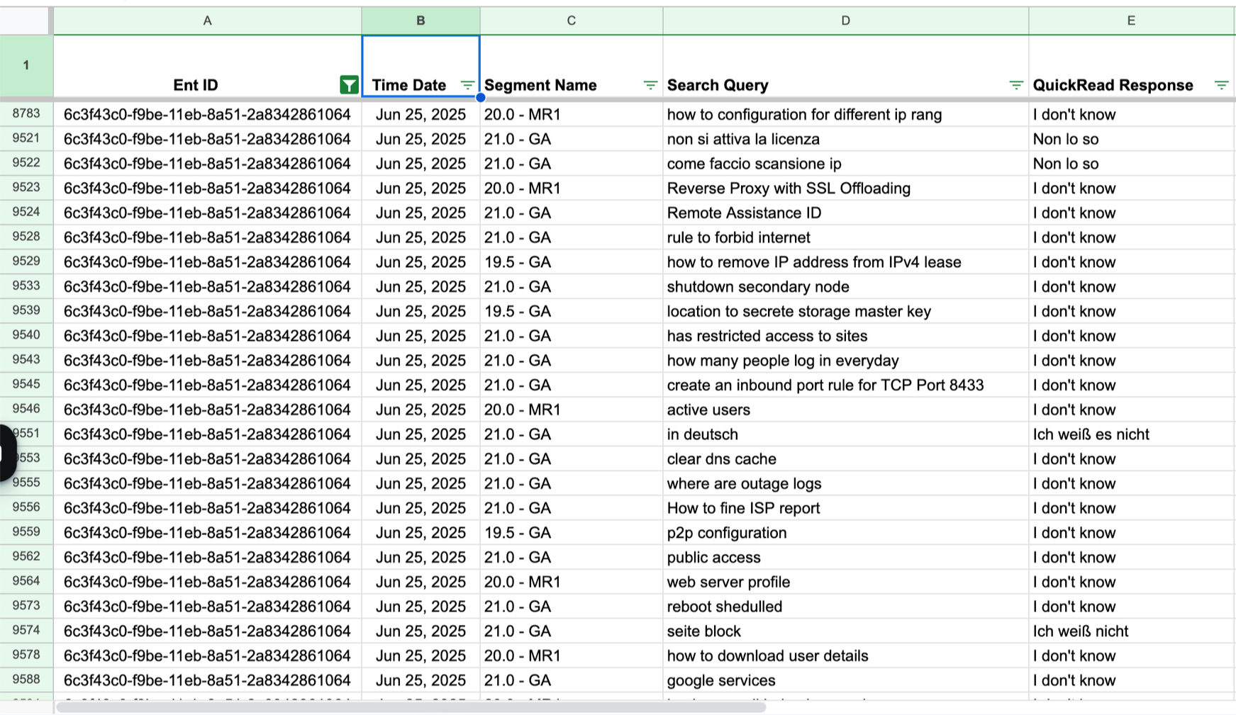
We launched a lightweight summarization AI tool called Quickread in early 2023, which gained strong initial adoption. However, by early 2025, its adoption declined sharply to around 2% M-o-M with most engagement limited to the first few days of onboarding.
Customer Feedback
Lack of Contextual and Personalized Responses - responses felt generic and disconnected from users’ work context.
Inconsistent Query Interpretation - similar questions returned varied results, reducing trust with respect to systems accuracy
Limited Conversational Depth- the one-question-one-answer model limited deeper exploration.
Low Readability and Prompt Support- long, unstructured responses and lack of prompt guidance hindered clarity.
Existing Quickread screens
Rise of Enterprise AI
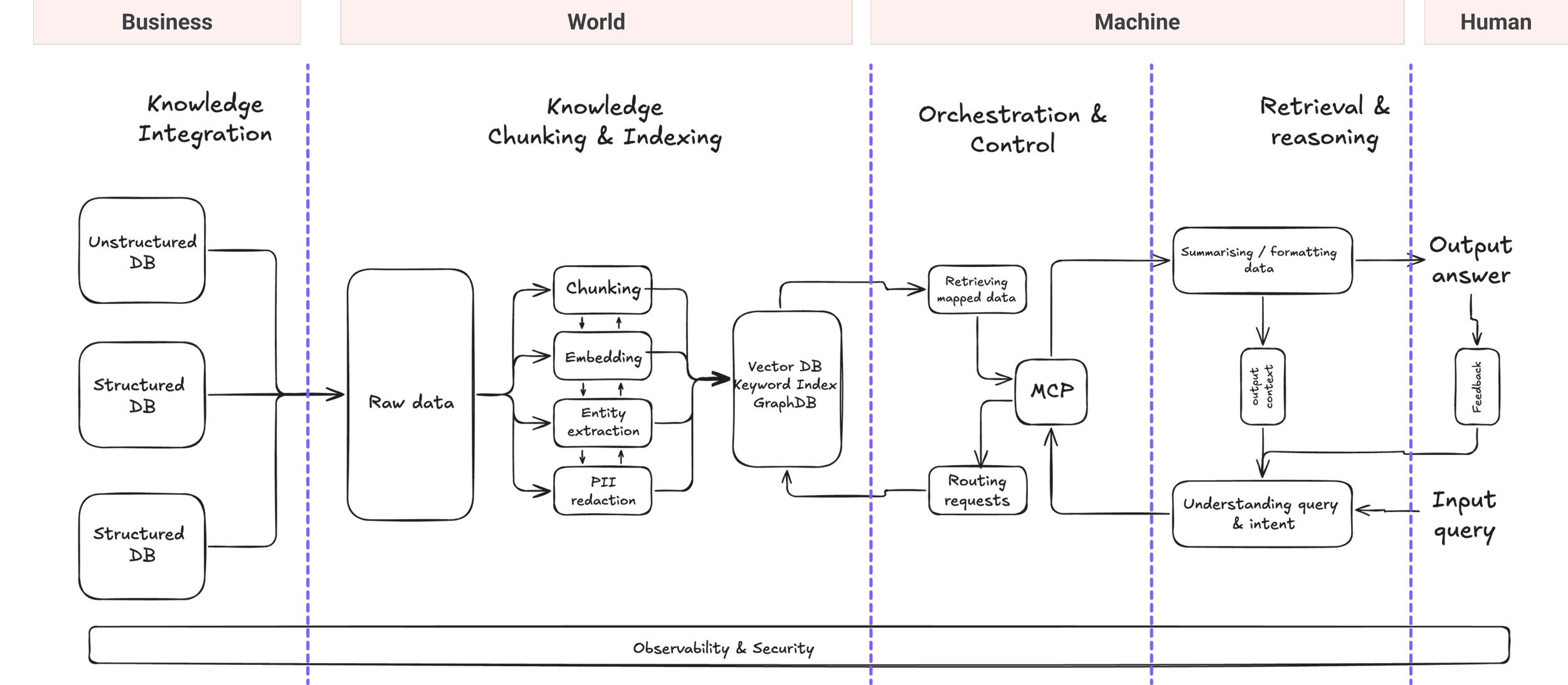
The rise of enterprise AI has made this the ideal moment to reinvent Enterprise Search. As organizations adopt LLMs, RAG, and intelligent automation at scale, employees now expect fast, context-aware answers instead of digging through scattered tools. AI can now connect silos, understand intent, and deliver accurate insights transforming how enterprise teams discover knowledge and make decisions.
Voice of customers
The Quickread experience
Lack of query refinement or follow-up, forcing users to recall and rephrase questions manually.
Single-turn interactions limit exploration, reducing flexibility and overall efficiency.
Long, unstructured text blocks hinder quick scanning and make information consumption difficult.
Lack of transparency on data sources and AI reliability lowers user confidence in the responses.
Feedback block is vague and unstructured, offering no guided way for users to share actionable input.
Inferences
Based on data, market analysis and customer feedback we narrowed down the insights to three essential items that would ensure an enhanced customer expereince

The Strategy
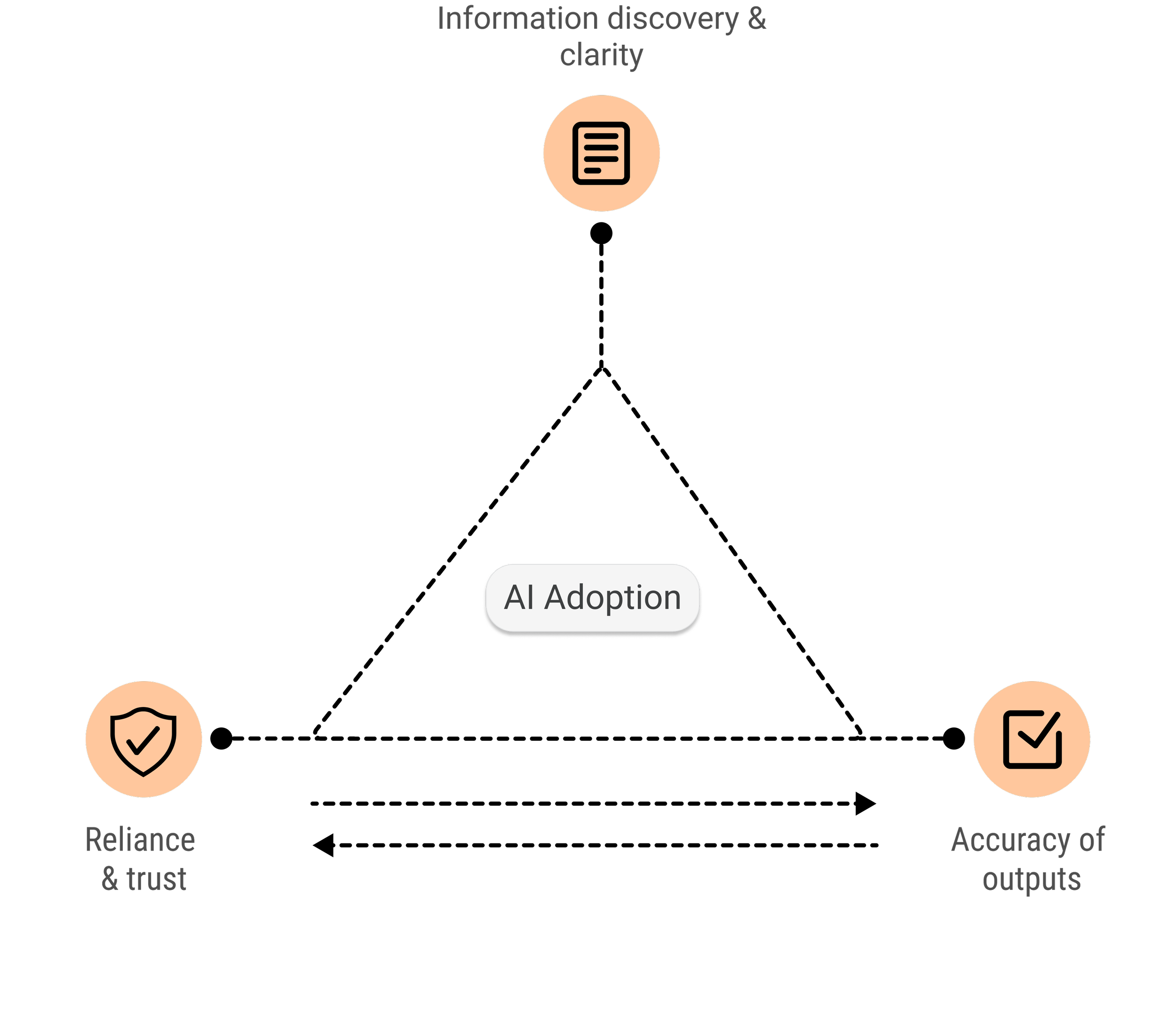
AI adoption
Effective AI adoption goes beyond intelligent systems, it relies on how seamlessly users can discover, understand, and trust the information presented. Enhancing accuracy, transparency, and cognitive ease ensures AI becomes a reliable partner in decision-making, not just a tool for retrieval.
R2C2 Framework for AI accuracy
AI accuracy is a key driver of user adoption and sustained engagement, directly influencing how much users trust and rely on the system.
Planning
At Whatfix Labs, we operate with a “build, test, learn” mindset, experimenting rapidly, gathering real user signals early, and aligning solutions to product–market fit sooner.
The Approaches
How might we enhance information discoverability and clarity
Information discoverability and consumption focus on helping users effortlessly find and engage with the most relevant knowledge with ease thereby driving productivity and informed decision-making.
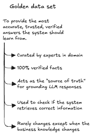
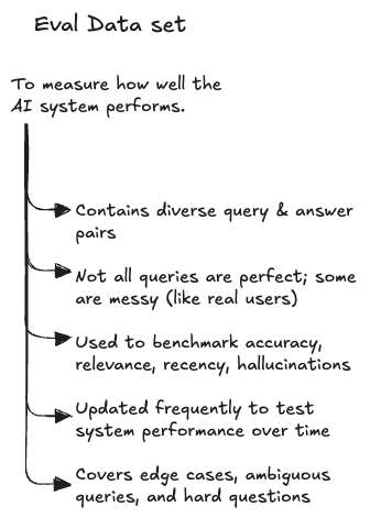
Data Grounding
How might we ensure reliance and trust on AI systems
Transparency and trust in AI is all about clearly showing how decisions are made and where information originates which in turn builds user confidence, ensure accountability, and enable responsible adoption especially in high-stakes domains where credibility and accuracy are critical.
The System
Design decisions
How might we enhance accuracy of outputs
Improving AI accuracy relies on data strengthening of how systems retrieve, interpret, and validate data. AI needs to generate responses that are not only correct but contextually aligned and verifiable, to ensure credibility and trust.
The Solution
Iterations & concepts
To iterate faster and explore multiple concepts, I created rapid mockups using Figma Make, V0, and Google AI Studio. This helped us communicate ideas quickly and align with stakeholders on the right direction for enhancing Quickread.
Iteration using Figma make
Screenshot of some designs we tested with our users
Anatomy of Quickread
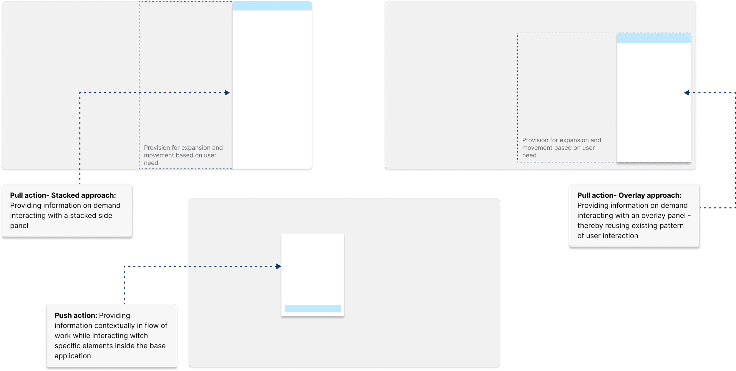
Multimodality
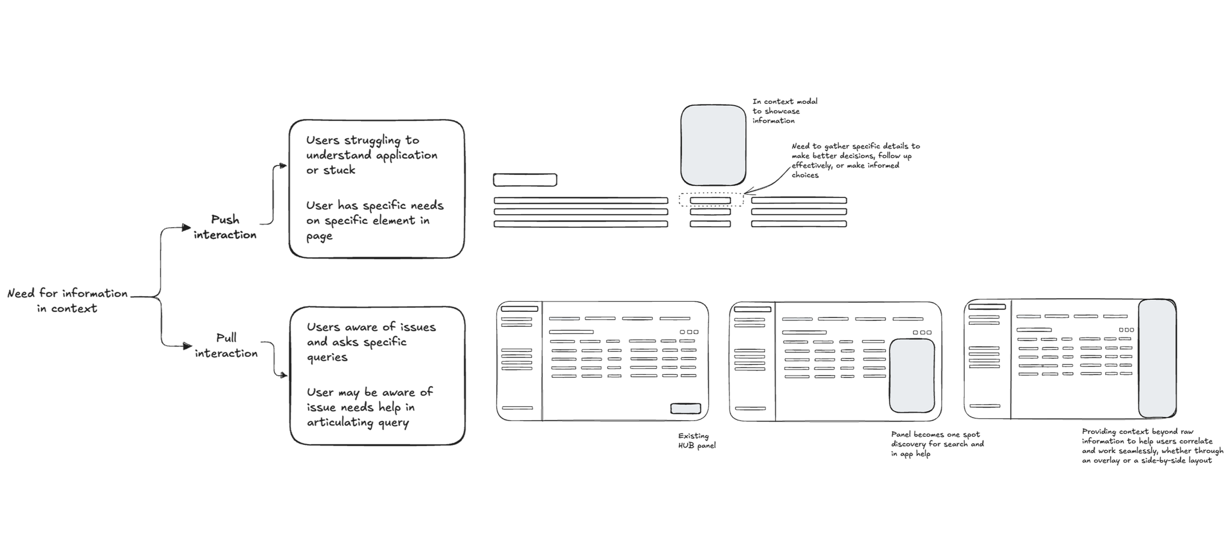
Multi-modal search embedded within the user’s workflow, adapting to the context of the application through various formats such as modals, overlay panels, or stacked views.
In-app Contextual Experience
Hyper-contextual information is embedded in the application, accessible through interactions on engaging with specific elements
Design Rationale

In-app Conversational Experience
Enabling users to discover information within their workflow by leveraging existing Quickread systems, reducing the learning curve, along with bridging lexical and conversational interactions
Design Rationale
Hybrid Search
An on-demand hybrid search that combines both lexical and semantic techniques, adapting dynamically to the user’s query based on the application context and the specific page or environment the user is currently interacting with
Omnipresent Experience
Enabling an omnipresent, context-aware conversational flow that supports seamless follow-ups and builds trust through transparent sourcing

The Impact
Quickread failed as a standalone AI agent
Quickread was initially envisioned as a standalone solution, with a long-term roadmap toward becoming an enterprise search platform.
Validation efforts identified Insurance as the only domain with a promising product market fit, leading to collaboration with only two design partners.
Demand for on-prem installations made scalability challenging and business wise non-feasible
Data privacy concerns particularly among enterprise AI councils prevented broader adoption as a standalone offering.
Quickread as an extension of DAP conversational experience
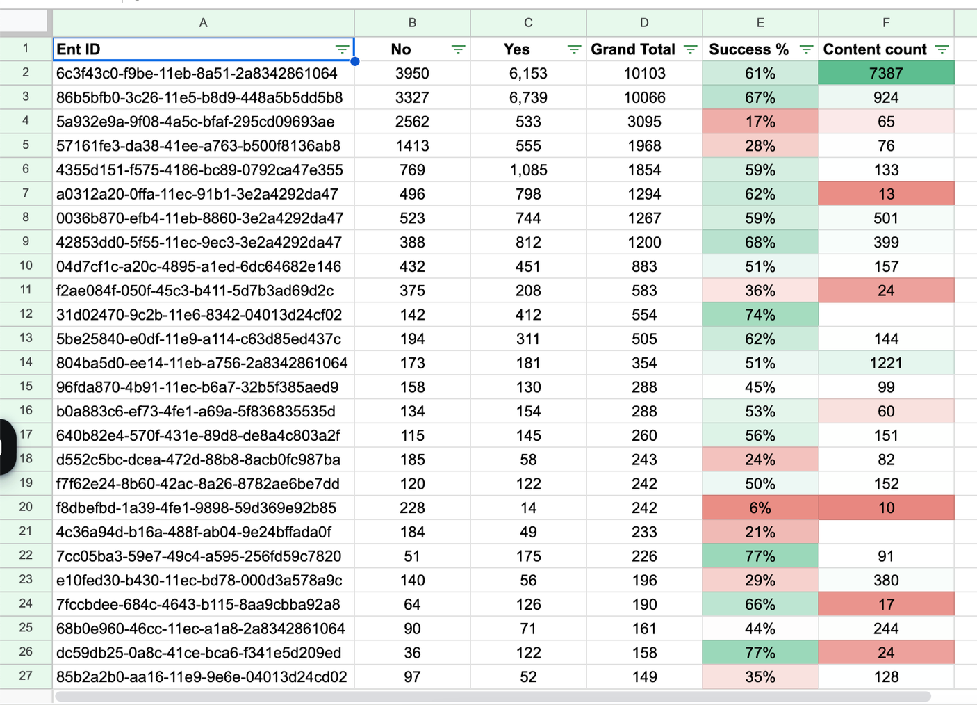
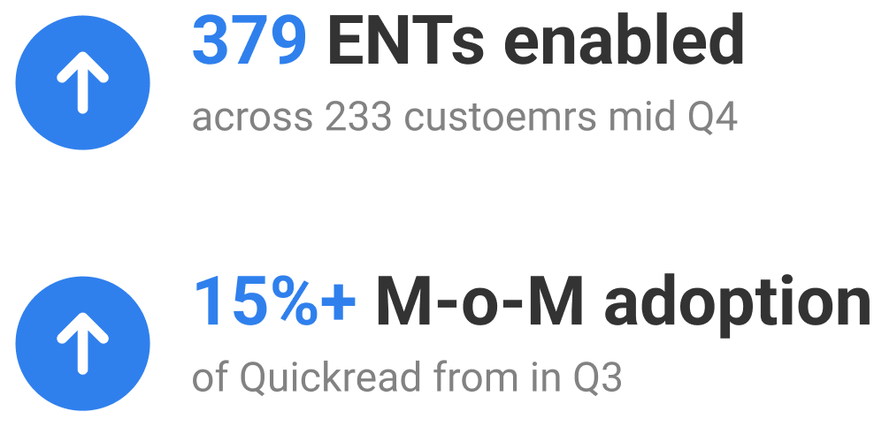
Quickread enablement went to an all time high of 379 ENTs across 233 customers
Adoption of Quickread increased to M-o-M of 19% by mid Q4
Got better qualitative feedback from customers around Quickread accuracy
Hits
Conversational experience for DAP - helped in building confidence in AI & existing products “So, like I can definitely 100% validate that right now in all our conversations and all our engagement, uh, this is spot on.”
Miss
Customers expressed considerable fatigue in connecting data repositories to Whatfix systems
My takeaways
AI trust comes from transparency, not magic
Users trust results when they understand why something surfaced.Recency, accuracy, and source tracing shape credibility
Enterprise users reject results that feel outdated or inconsistent.Retrieval quality greater than UI polish
A beautiful interface fails if the information aren’t strong.AI experience needs “boundaries”
Users perform better when the system involves human in the loop rather than giving all control to system
Way Forward
Based on the progress and POD review, leadership decided not to pursue QuickRead as a standalone product
Enhance integrations experience for application and custom repositories
System to manage, sync updated information
Support customer’s preferred LLM with selective on-prem feature availability.