
Driving adoption and engagement for enterprise applications
Countless apps are used daily, yet most aren’t built for individuals. Whatfix helps individuals adapt and engage with applications by simplifying software guidance, analytics, and experience simulations.
Image- Whatfix dashboard
Quick Note
Before we dive into the case study, a quick note: this project reflects over eleven months of iterative work, which is why the narrative is detailed, comprehensive and may perceive a little long.
For easier navigation, a floating “Quick Access” button is available on the right bottom corner of the page to help you jump across sections.
My Journey
At Whatfix, I work across two tribes, the DAP Discovery pod, empowering content authors to design and customize widgets that improve end-user onboarding, adoption, and engagement; and the AI Labs pod, driving the 0-to-1 scaling of AI Saas products. I also contributed to the mobile DAP pod as well
Our Users
Whatfix serves three key personas, both directly and indirectly, each with unique goals and interactions with the platform:
End Users - The employees or customers who engage with enterprise content within their organization’s application
Admins & Managers - Configure, monitor, and maintain platform performance and adoption.
Learning & Development Authors / Instructional Designers - Create and manage in-app learning content and experiences.
The Signals
Context
Self help & Tasklist are overlay widgets on the base application that act as a go to place for end users to discover, interact and consume various content types for better adoption and understanding of their application
But at the end of Q4 of 2024, there was a significant dip in engagement & open rate for the end user panel to as low as 20.8% for even higher performing ENTs
Product Board tickets showcasing customer concerns
Data showing drop in open rates
What was happening ?
Customers particularly admins and content authors struggled to customize the panel to align with their base applications.
As a result, the widget appeared disconnected from the base application, reducing brand consistency and user trust.
Understanding the problem
Analyzing existing AC codes, Technical configs and CSS
Around 80% of widget customization and styling relied on AC code, technical configurations, or CSS, implemented by solution or sales engineers based on individual customer needs.
This resulted in increased support tickets by 22% on average, inconsistent experiences across customers and a lack of unified product vision
Customizations implemented across 1,200+ enterprise accounts included:
Styling adjustments for corner radius, colors, spacing, fonts, headers, FAB icons, and description text on the widget.
Widget orientation tailored to end-user requirements.
FAB size modifications based on customer preferences.
Widget placement (latching) to specific sections within applications for contextual relevance.
Competitive Solutions
Users voice - feedback on dashboard from content authors & admins
Lack of flexibility to custom the widget based on the customer needs
Redundant effort when customizing two similar widgets within the same dashboard, leading to inefficiencies.
Inconsistent customization options between Self and Task lists create higher cognitive load and a steeper learning curve for content authors.
There is no easy, no-code way for customers to configure or personalize the widget UI, increasing dependency on Whatfix support.
Users voice - feedback from end users
The end-user experience is falling short, leading to confusion, frustration, and inefficiency for both customers and partners.
The default Whatfix UI is perceived as complex, outdated, and unintuitive, lacking modern design quality and polish.
Product updates often remove previously supported features, disrupting seamless migration and content updates for customers
Existing product experience
AC code example
Understanding competitor solutions
Out-of-the-box customisation functionalities, enabling content authors to configure and deploy independently
Have minimal reliance on product support.
10/12 competitors have a unified experience of their help and tasks widgets
Provided 3rd party and in-house chat/bot integrations
Voice of customers
Voice of end users
Heuristic analysis of existing experiences
Overwhelming configurations with excessive cognitive load making users struggle to locate the right control or understand its impact
Inconsistent visual and interaction patterns across dashboard configurations and end-user widget
Lack of consistency & hierarchy along with dense layouts thereby increasing scanning time and the likelihood of errors.
Limited personalisation for diverse end-user contexts.
Inferences
Based on data, heuristics, competitive analysis and user feedback we can narrow down the insights to three essential items that would ensure an enhanced customer expereince

The Strategy
Enhancing Customer Satisfaction
Empowering users, ensuring stability through updates, and providing a consistent, reliable experience to strengthen Whatfix’s value and elevate customer satisfaction.
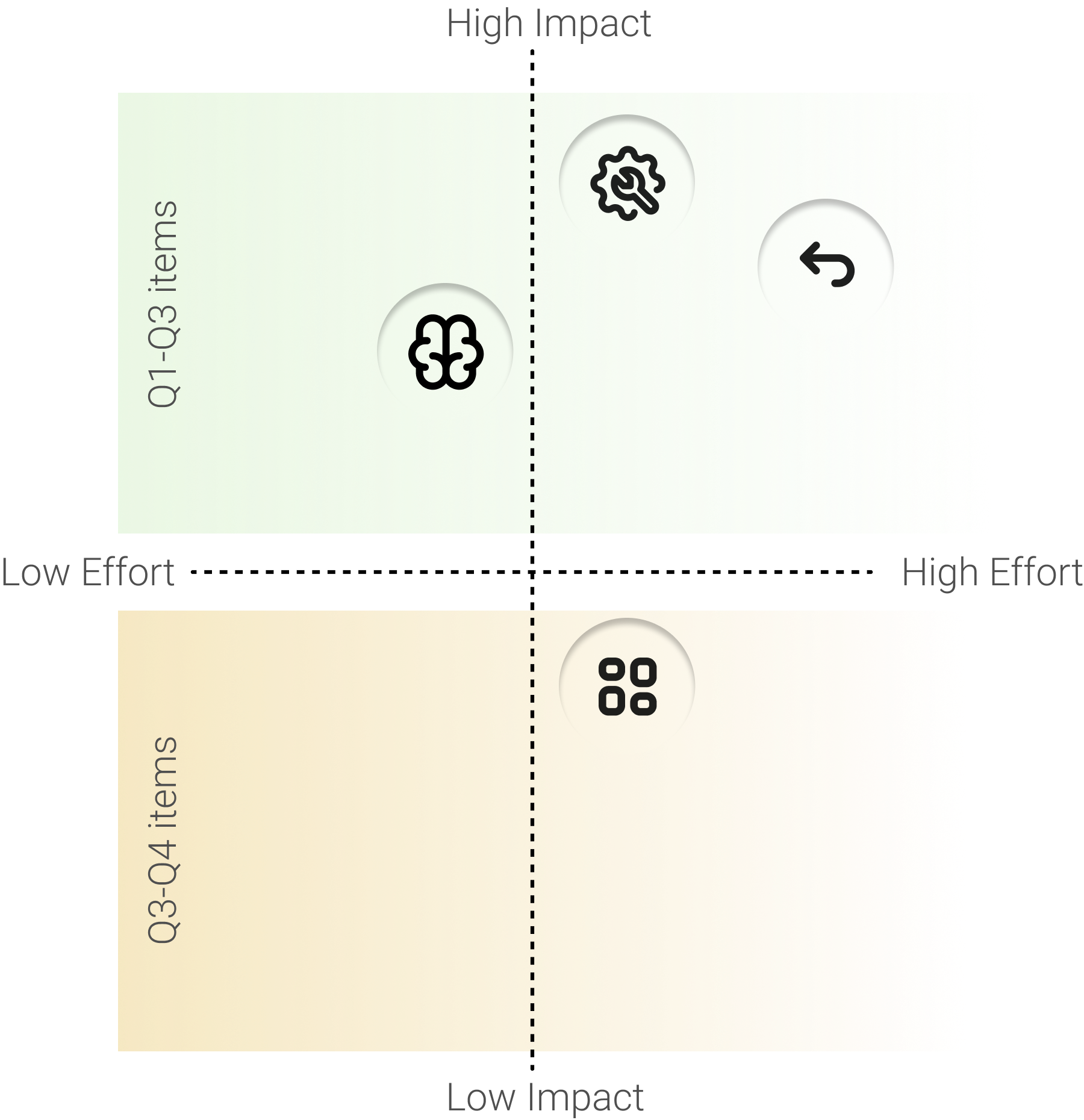
Impact Vs Effort
To drive customer satisfaction, our team ( Product Manager, Designer & Engineer trio) prioritized high-impact initiatives to deliver immediate business returns while balancing quick wins with long-term value.
Although the unified widget experience was a lower short-term priority, it was important from design to champion for strategic foundation of a scalable, cohesive and consistent end-user experiences for the future..

Planning
To ensure every problem was effectively resolved, migrated to newer systems, and delivered across more than three quarters, it required meticulous planning and close prioritization across Product, Design, and Engineering teams.
Proposed Whatfix Strategy
The strategy focuses on minimizing reliance on solution engineers, content authors, CSMs by strengthening data analytics, enabling product self-service, and enhancing end-user issue reporting.
Proposed Whatfix process
The Opportunities
Defining Influence Areas
Identifying the key areas of the product that would be influenced by the proposed solution
The stylisation of the end user panel on dashbaord
The end user experience of HUB panel
How might we ensure self serviceability
Self-serviceability ensures that content authors and admin personas would be able to configure the widget and publish easily by themselves, without no to minimal help from Whatfix support
How might we ensure backward compatibility
Ensuring that all widget configurations previously built using AC code, technical configs, or CSS in local environments are fully supported in the new solution thereby reducing dependency on solution engineers, minimizing maintenance overhead, and preventing conflicts with future product updates.
Influence areas
How might we reduce cognitive load
The aim was to simplify dashboard experience for authors and creating an intuitive, well-organized Widget Hub for end users, we can ensure both groups focus on key tasks with minimal effort and maximum clarity.
How might we have unified widget framework
A unified widget approach simplifies configuration for customers by enabling shared styling across modules, reducing repetitive setup efforts. For end users, it creates a cleaner, more cohesive experience, bringing all in-app assistance in one flexible, easily accessible interface.
The Approaches
End User experience - anatomy of widget
The end-user widget was envisioned as a lightweight, contextual interface that surfaces key insights and actions within the user’s workflow, ensuring quick access and minimal cognitive load.
Entry point ideation
The entry was envisioned to be a FAB which had evolved across quarters based on customer feedback and usability testing insights
Panel ideation
The panel was designed as a unified, actionable space for content consumption, task management, organizational information, and communication.
Defining the HUB panel
Content Author experience - Dashboard stylization
The dashboard evolved from a space where content authors merely customized the product to a platform that empowered them to craft better user experiences through purposeful customizations and interactions, driving higher adoption.
Options lack clear visual separation, making it difficult for users to distinguish between them.
Users struggle to recall which tab provides which functionality due to low recognizability.
High reliance on text makes it hard to quickly scan or understand information.
High learning curve as users can’t easily form mental models of the interface.
Excessive segmentation of information required users to recall the purpose of each tab, making it difficult to understand the full range of available functionalities.
Non-intuitive styling discouraged exploration and experimentation, limiting users’ engagement with the interface.
While the visuals supported user understanding, key functionalities were difficult to discover within a single scrolling view, limiting overall feature exploration.
Too many toggles and clicks were required to complete customizations, adding friction to the workflow and slowing users down.
Enhanced clarity in content segregation and a more visually engaging style section improved initial usability.
However, the information hierarchy remained complex, leading to a continued high learning curve for users.
The HUB Dashboard experience
The Impact
Through continuous user testing, customer feedback, and periodic design refinements, the experience gradually evolved into a more intuitive and cohesive solution.
Older Dashboard experience
New Dashboard experience
Testing with Customers
After the design handoff, the experience was first deployed to a UAT environment for a controlled Beta release with select customers. This helped us validate the build, surface usability gaps, and collect early feedback.
Once the Beta phase concluded, the team initiated a phased GA rollout. During GA, customers custom requests for other refinements, which were captured and prioritised into the product roadmap backlog for future iterations.
The Business Impact
As of October 2025, the 75th percentile SH open rate reached 28% and continues to rise, accompanied by a 20x increase in ENT ID creation indicating
Content creators are publishing significantly more content for end-user consumption.
Open rate grew by 8% in less than 10 months
Engagement now stands at 53.4%, the highest since the initial GA release.
Hits
Content authors appreciated the current widget implementation, noting that “the experience now feels on par, if not better, than other products in the market.”
Miss
Customers expressed curiosity about how the new DAP experience would evolve for both end users and content authors in the rapidly changing landscape of AI.
Way forward
Further iterations are still on to
Unified platform experience for web, desktop, OS & mobile
AI journeys discovery on end user widgets
Notifications on web to enhance end user communication
My Learnings
Top 3 things I learnt
Enterprise products require training stability
Non-periodic changes disrupt workflows; supporting older versions and legacy systems is essential for smooth adoption.Simplifying complexity demands ruthless prioritization
Even powerful systems become overwhelming without clear hierarchy and structured controls.Progressive disclosure is critical for enterprise tools
Not every control needs to be visible upfront showing inforamtion at the right moment matters.
